Connect IT Global
Connecting you to
the ultimate brand experience
Services:
- 3D Graphics
- Advertising
- Branding
- Creative Production
- Web/App Design
Team:
- G.Creative
About the project
01
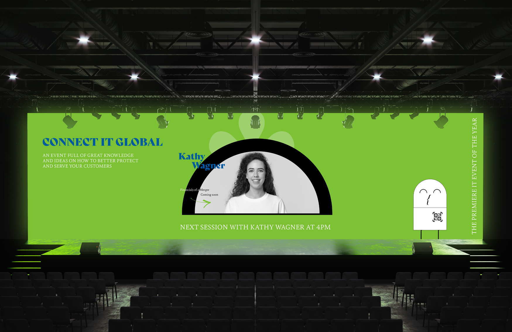
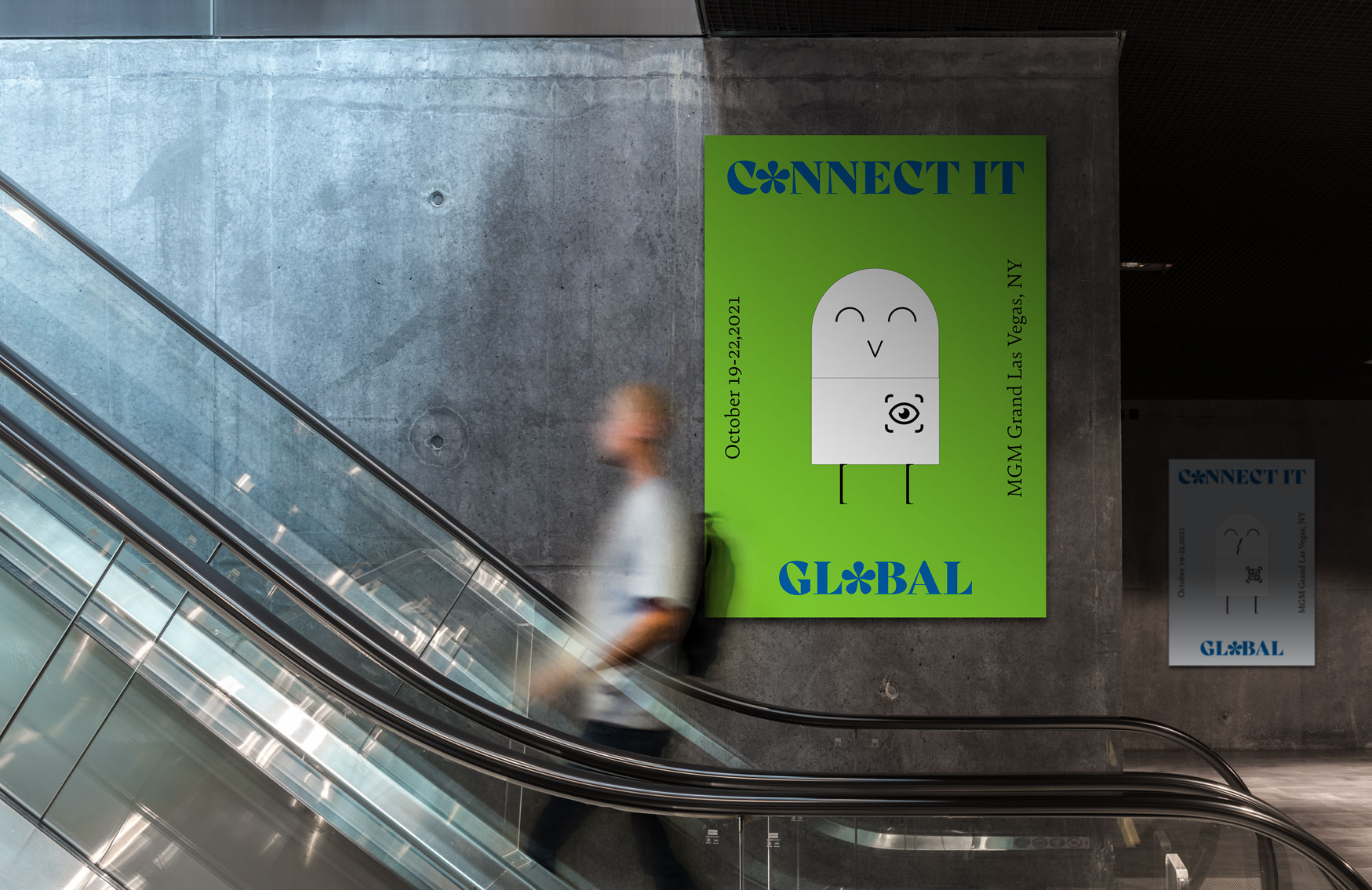
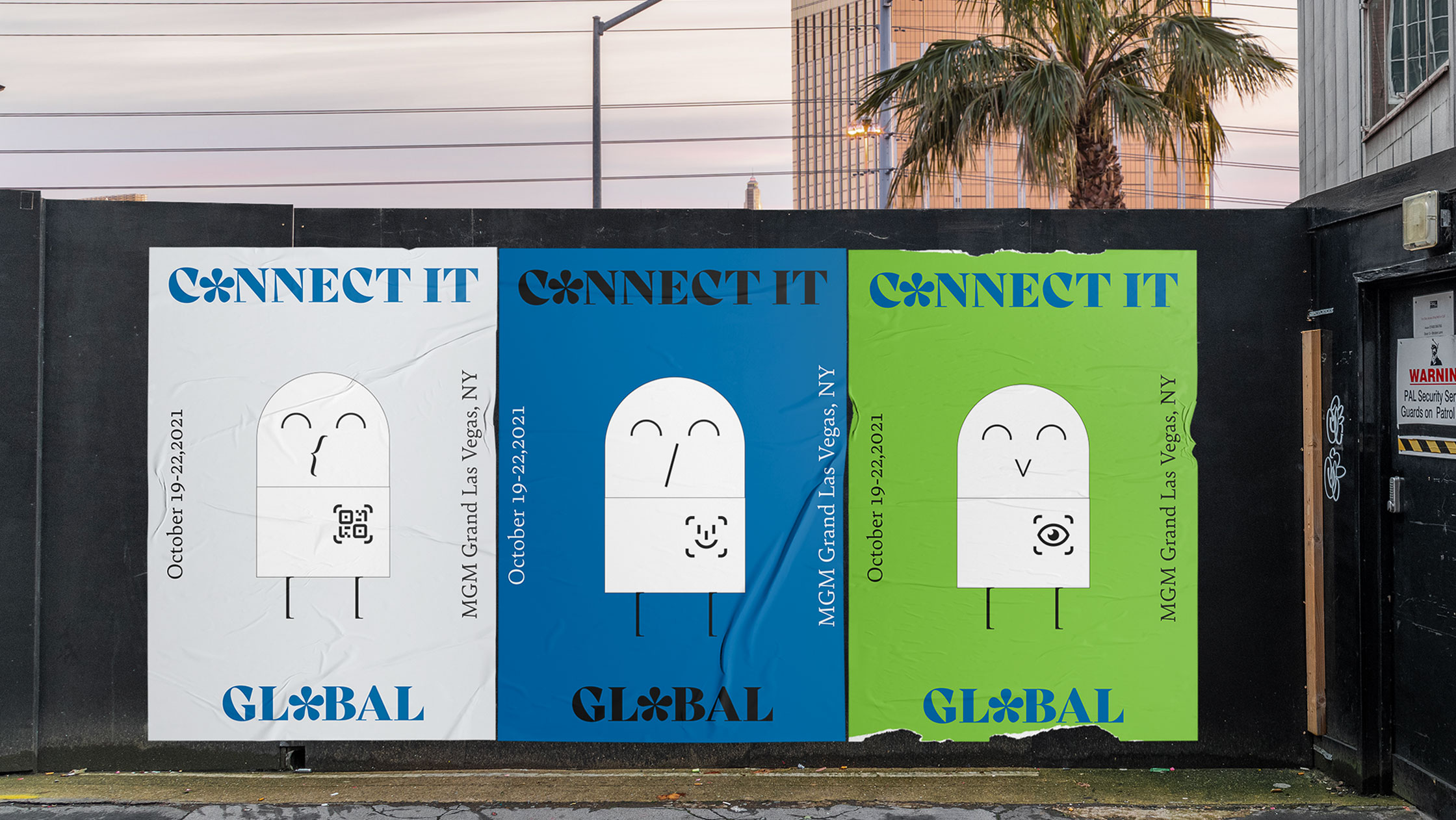
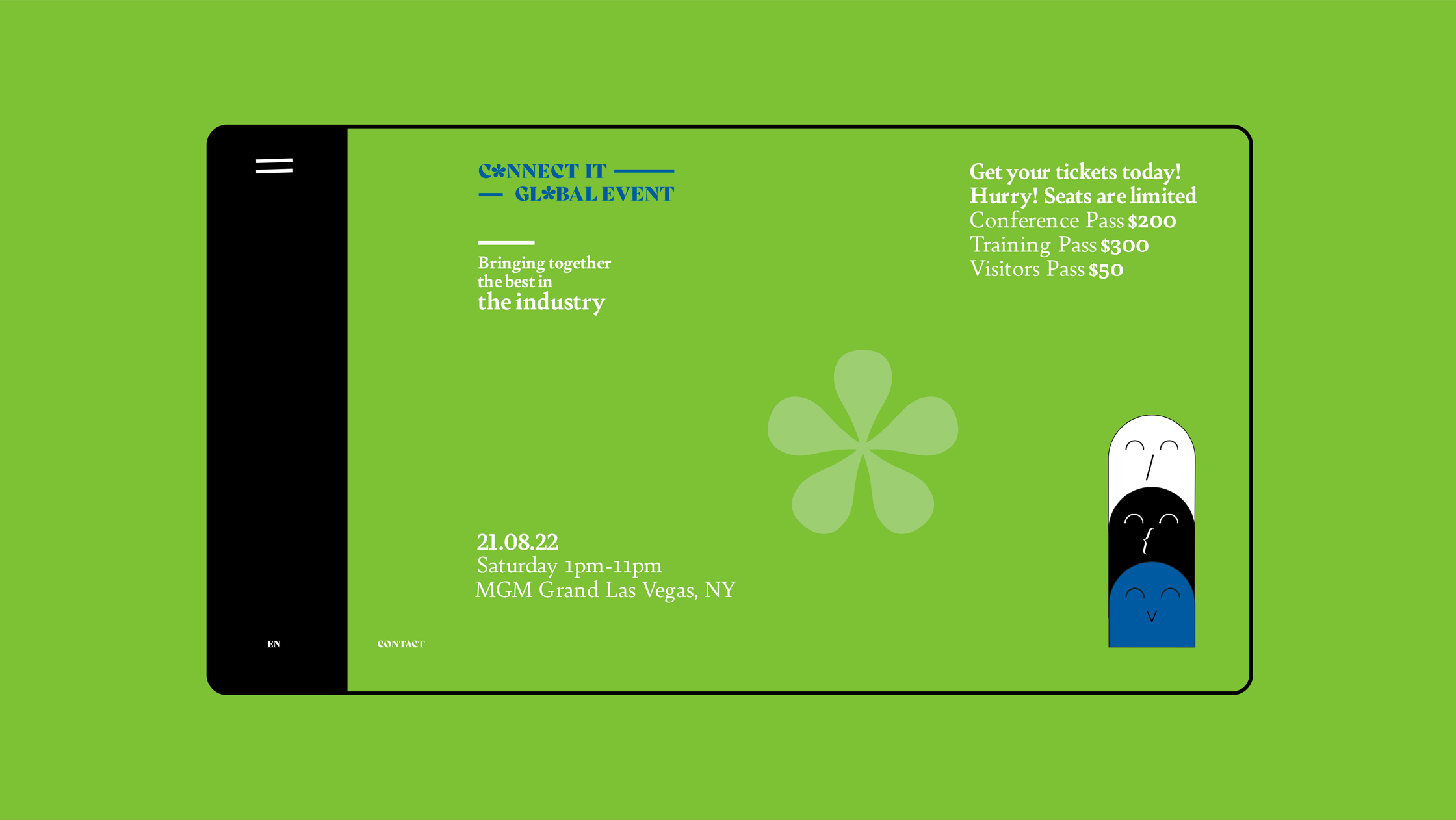
Connect IT is the premiere IT event of the year. It is designed for leaders and experts in the IT service industry looking to help build systems, evolve their companies, and help lead the industry into a stronger tomorrow.
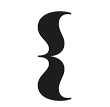
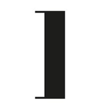
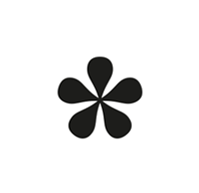
Special Characters
Challenge
02
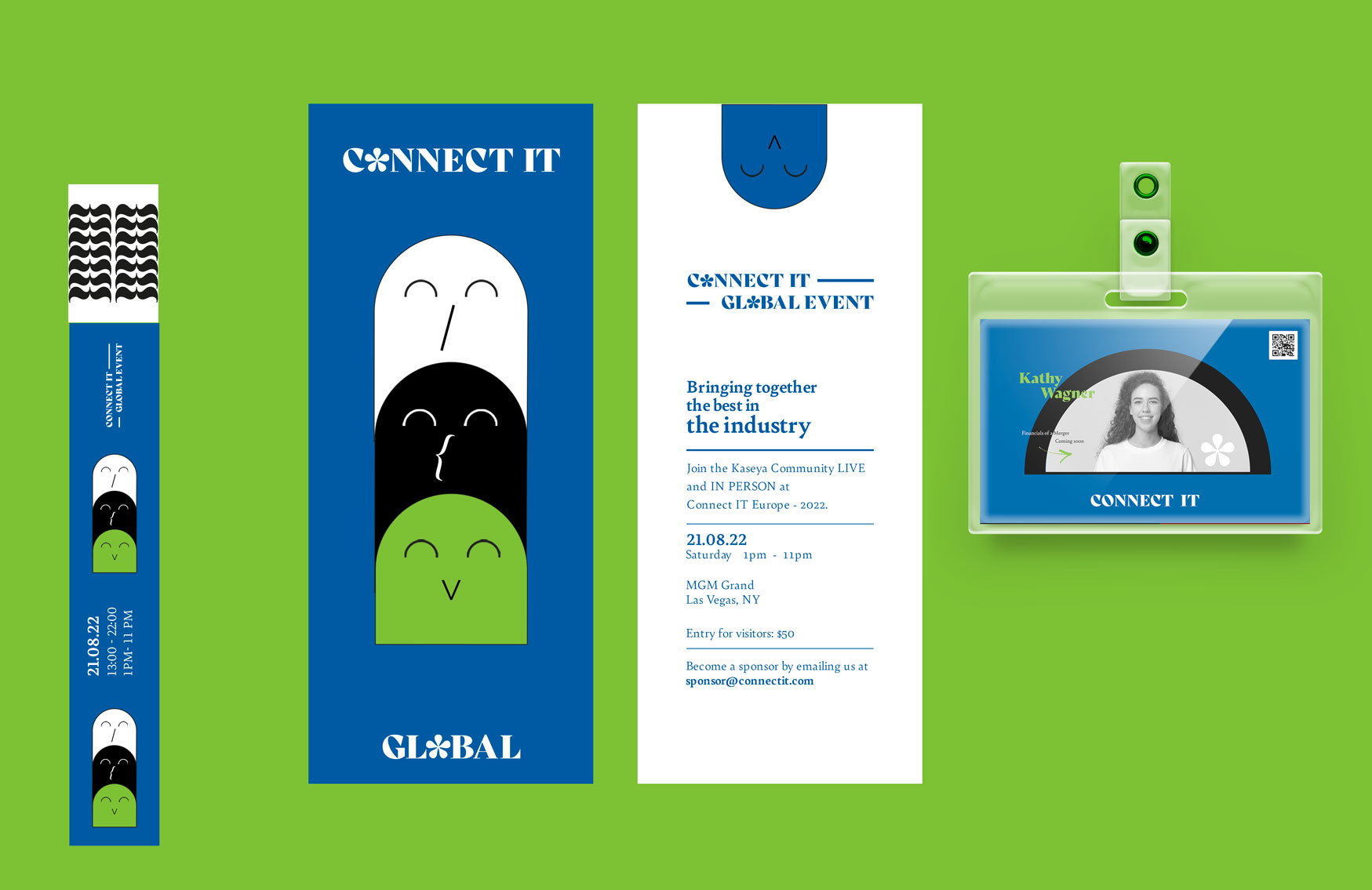
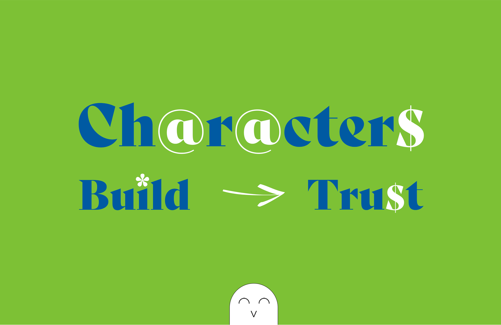
Rebranding an old school logo with modernity. Adding characters that would be used as visual elements for future branding.
Strategy
03
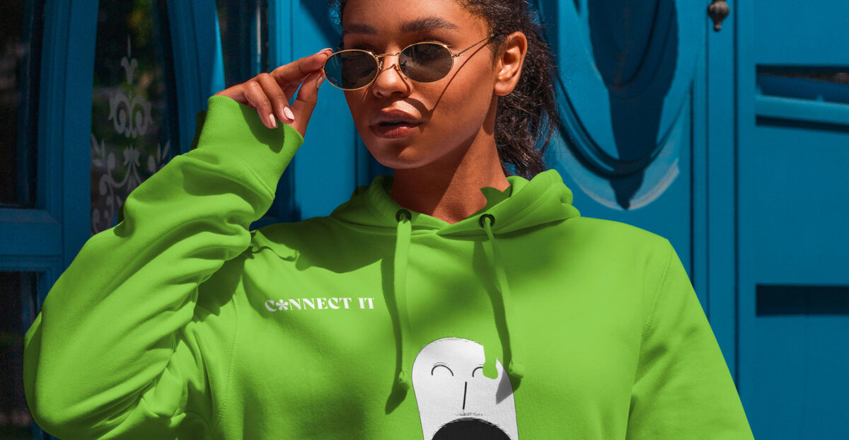
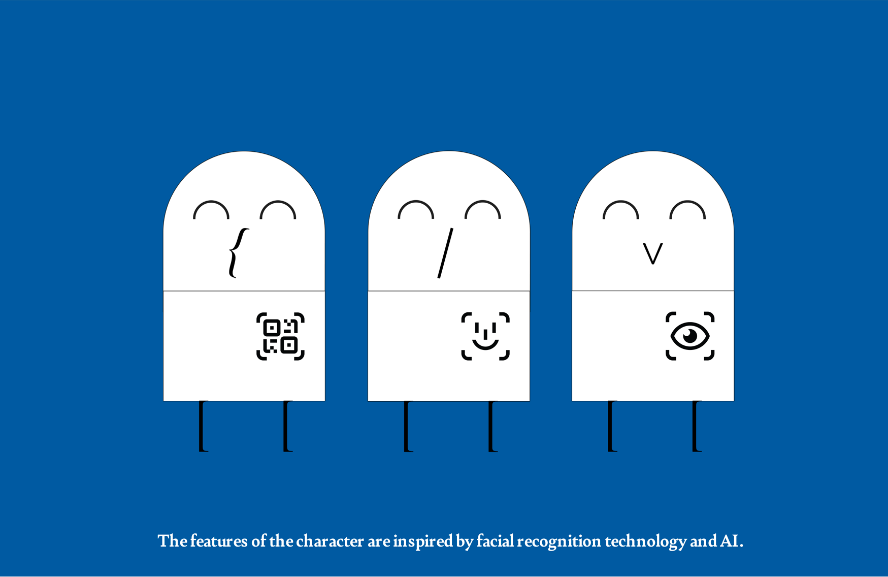
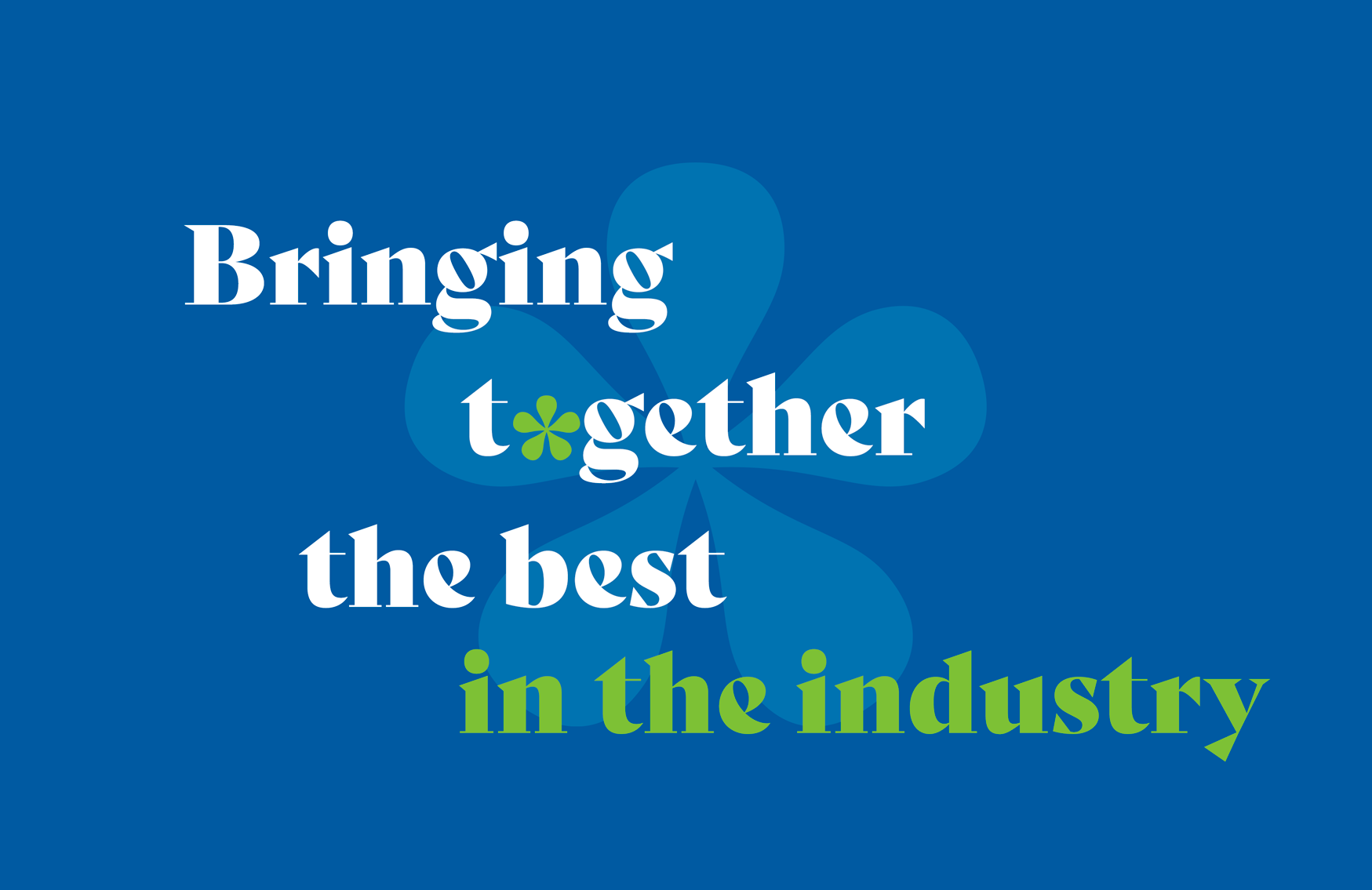
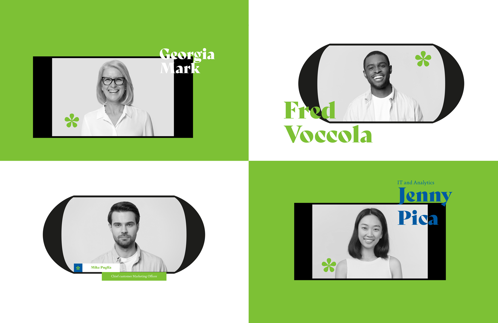
Approachable, fun, revival, human and AI. These were the keywords we derived from our rebranding insight for Connect IT. Keeping these in mind, the grotesque typeface was selected to focus on the revival of the retro look whilst reflecting warmth, playfulness and good readability function. The colors blue and green symbolizes intelligence, trust and rebirth. To bring it all together we created a character to depict connectivity whilst combining the human, IT and AI form.

Special Characters
